Friday, 26 November 2010

Personal Opinions

Cat: These couple of weeks of surverying World's End Place has been very useful and enlightening. Useful because it gave us an insight as to the depth needed in analysing and surverying a site, and because we did not get assigned an actual building it made us think more about how to engage with our space. It was also enlightening because it broke my stereotypical view of Chelsea, there is not just an 'upper air' to the borough but living side by side are estates.

Sarah: At a first glance The World's End Place seemed rather bleak and unnoticeable, however after studying it's nearby surroundings it became more clear that the project was directed at creating a social environment as opposed to being purely a design convention. I think it is successful in merging the two areas through the colour scheme as well as simple design. It acts as an open space and does not overwhelm either the estate or King's Road. However, I feel it is not suggestive in creating a place for relaxation or intense social activity, but instead acts as a walkway and space of temporary measures.


Heather: Personally I have found the space of "World's End Place" quite an interesting one to look at because of its multi functionality. On one level it acts as a place to socialise, sit and relax, and on another it serves as a thoroughway from one place to the next, and in turn unites these two areas. Although I like the purposes it serves, of which I think it does well; aesthetically I have to say I find the materials used make a place that gets little light seem even more cold and grey, and combined with the surrounding buildings, quite an overwhelming sense of brick and concrete.   

Thursday, 25 November 2010

Environment of Chelsea


We chose to walk to the World's End Place from Sloane Square Station, which took roughly twenty minutes. We documented our journey to show what other types of architecture were surrounding our site and get an overall feel of the area of Chelsea.


Buliding which particularly caught our attention mainly due to the materiality - almost using interior finishes as exterior element.

Clock which moves backwards above Vivienne Westwood store.


We also noticed that as we headed towards the World's End Place, the street became more narrow, and the shops became collectively smaller unlike the Habitat (furnishing store) at the start of the King's Road. 


Relation of Spatial Design to Surrounding Environment

This image is taken from yell 3d maps, to get a clearer understanding of the relationship between the geometry of the space to it's surroundings. The image is useful due to it's two-dimension, clearly displaying a coherent purpose throughout the area.


Firstly the angle at which the ovular seating area is set reflects that of the direction of the space, almost having the effect as to invite you into the space. So in contrast if it were to have been set at a right angle to itself it would have acted almost as a barier between the street and the space; it instead unites the area.

Whilst the ovular section follows the flow of the angled buildings the lighter paving slabs forming a linear pattern accross the whole space, follow those of the buildings set parallel to it. This design feature again acts as an invitation into the space, to draw you through it. However it also gives the space a much lighter feel due to the combination of organic colours, whereby if it were all paved in the darker slabs it may have appeared oppresive and dull. It helps instead give a much more open and airy outset to the space, without becoming too bare.


This image is taken from google maps, seeming inaccurate to the space now as it is pre 2006 determined. Although not a particularly clear view, We feel that the grassed area before McAslan's benched space, may have been better suited the surroundings. In an area largely consumed by grey concrete and bricks, the grassed area seems a welcome change to the materiality of this space; a welcome natural space encased in a manmade quadrangle. However the new design occupying the space now, does seem alot brighter and more open.

Wednesday, 24 November 2010

"A Picture Is Worth A Thousand Words"

Here are some further photos which we thought helpful to illustrate our site:


  1. During late afternooon, sun is going down and the floor spot lights light up. 
  2. Children playing outside the local cafe.
  3. Closer view of the maintanence of the seating blocks, crisp packets stuck in between the wooden blocks.
  4. Cigarettes stashed underneath the seats, rather unpleasant. 
  5. Grafitti on the seating area even when its not completed.
  6. Granite surface of the seating cubes. 
  7. The various floorings put in.
  8. Stainless steel bins, any dirt is clearly visible on them, would cost to clean.
  9. Drainage issues, helps to discolour walls. 
  10. Close up of the discolouration.
An attempt at fully representing the space is terms of textures as well a physical structures. Displaying perhaps a usage of the space, and the more organic/natural events taking place there now.

Environment of World's End Place

As the trees are relatively new they do not seem to fit in yet but with time they will adapt and make the space appear more organic and natural, bridging the clear gap between The Worlds End Place Estate and King’s Road. The space does not seemingly have very strong green considerations. Although there are trees planted there are not enough to suggest that it is strongly environmentally friendly. Speaking in terms of the colour palette too, the trees are too timid to make a striking green in the area. 


In the winter, the trees will help act as a wind break along with the surrounding buildings but the downside will also be that it hinders sunlight into the area to provide lighting and warmth. The available spot floor lights and lamp posts are not strong enough on their own as a major light source so at night time may not be an ideal/safe place to hang out. Another downside to the surrounding buildings and trees is that they funnel neck the rest of the wind into the space making it very blustery and chilly. However, in the summer this generates a welcoming shady area.

Quite bare, demonstrating minimal interaction

A message of encouragement for interaction is not really present in the site as, physically, there is little solid structure within. Also, if the intentions of the architect were to help bridge the two communities, cover any dissimilarities in environment and encourage communication then he has not 100% succeeded. Those living on the side of the World’s End Place estate stay on their half, socialising in their local cafe and newsagents whereas those living in the houses opposite (as we have observed) hardly exit their doors to come cross the road but just walk down King’s Road to other destinations. It is not hard to see why they would go someplace else as the estate can be quite intimidating, there can be quite aggressive voices and behaviour accumulating in this space and observing their behaviour felt at times uneasy.  

World's End Estate half
Looking towards the other side away from the estate

The estate in our opinion is more dominating than the site itself, the focal point has wrongly been redirected to the orange mud coloured building rather than the newly constructed £1.4million area; residents have expressed their astonishment at the figure seeing price surpass the outcome. 

Construction


The construction of our site is essentially very basic with the paved floors and seating blocks. As previously explained the space is used as more of a walkway/pass through area, hence it’s flat surfaces. The gentle slopes allow for a level surface creating easy access for the elderly and mothers with push chairs. Minimal obstacles allow for quite an open plan space creating somewhere for children to play during the summer. This does create a problem though, it gives teenagers at night time a space to hang around and take control of the public space by playing football etc. The tree’s have not fully developed yet but once they are they might be disruptive towards the surrounding paved areas because of the neccessity of sweeping up the leaves. 


The site is currently under construction so was rather unhelpful for us in surveying the space. It also meant that the residents would miss out on the vast space for potential activity, imagining something like a fruit and veg market stalls. However, the simple design allows for a shorter construction span acting as an advantage, as the space can easily be occupied by the residents again.

Wednesday, 10 November 2010

Structure


By far the central draw of the space is the large ovular area. Above demonstrates the architect's clever way in highlighting the area within the whole paved space by raising the oval and having a step up towards the end. Also noticing the change in texture from linear lines to a far smoother exterior.


This image of the other side shows how it becomes further raised with more steps, increasing the defination of the space.

(Due to construction works it was not possible to take our own clear images to illustrate this point. Instead these are taken from http://www.esi.info/detail.cfm/Hardscape-Products-Ltd/Natural-stone-materials-for-Worlds-End-Place-London/_/R-201.2401#)

Above you can see how the large ovular benched area interacts with the rest of the area. One of the main things to highlight is how the oval is angled in the general direction of the space so that it works with the space rather than oposing and disrupting it. From above you can also see how different paved slabs are use in the space, shown below as well. I think these help to define the space as they are used through out.


Looking at material connectivity, the elements making up the bench to be combined consist: of granite blocks as the main structure of the benches; wooden slats that make up the seat section; and stainless steel blocks acting as seating dividers.We firstly looked at how the wood had been connected to the stone. As you can see in the image below each wooden slat is initially joined to two thin lengths of stainless steel, one each side of the bench. When looking closley at this section it was difficult to see any sign of how they had been joined, and as we couldn't even see any evidence of screw heads, we have therefore made an educated guess as to how they are connected; counter sunk screws, into threaded holes.

The stainless steel lengths are then attatched to the main body of the benches; the stone blocks. Looking closely the use of a nut was evident, but again with no obvious exit hole, we have to make an estimated guess, this time suggesting the use of a threaded length screwed into the stone base, through the bolt, and then up through the stainless steel. Lastly the join between the blocks themselves and the ground is done by a clearly evident use of cement.

Wednesday, 3 November 2010

Materials


Straightaway, the three key materials involved in the benches are demonstrated in this single photo. Quite simply stainless steel, granite blocks, and wood, with smaller connective parts of nuts and bolts, and concrete adjoining the blocks together.


The above image shows the gentle contrast between the natural and manmade elements that make up the area. As a fairly new build, well in tree terms, the trees have yet to fully develop and crate an impact on the space that they were intended to do. Although this may be combined with the fact that our study of the place is during the autumn/winter. I think it is also interesting to note is the contrast in colour; the brown/orange tones in the bark with the dull greys of the paving. This is also exaggerated now by the autumn colours - reds and yellows.

Looking more at the materials used, some people may conclude that exuberant design was not at the forefront of McAslans mind, but more of a psychological aspect in which to create a social space. However, the materials are up to date and the colour scheme is monochromatic so will not date quickly. The timeless design is also enhanced by the simple shapes used however the mix of the oval and cubic seats does not follow any particular theme. The simple form conveys a rather cold environment, which is also reinstated by the lack of shelter making it feel sparce and exposed. When visiting the site for a second time on rainy day, the colours of the materials seemed far stronger and vivid, with a slight gloss to the finish. The granite floor and parts of the new water feature became more appealing to the eye, which suggested to us why they were installing the new additional feature.

The space is used as more of a walkway between the Worlds End Estate and Kings Road rather than what we feel it was intended for: to renovate the area and bring the two sides of the road together. This means that one of the points for the design brief will have been that the materials needed to be robust and easy to maintain, although it doesn’t look as though it has been for a while (maybe after the renovation has finished). The robust quality will come from the use of granite, with the constant movement across the space it will need to resist signs of wear pretty well so this is a suitable material. The cube seating blocks are also made from granite therefore are sturdy.


Another positive, the design and materials used are very complimentary to a modern style. Clean geometric shapes and lines match the definition of modern architecture. From our personal experience of looking within the estate building, the materials used for the site are undeniably ‘cleaner’ and better maintained.

In terms of aesthetics, style and taste is indefinable because of personal preference. Though some may say that the design is sleek and clean, others may perceive it as dull and boring. It is fair to say that what John McAslan has designed is simple enough to come between the two viewpoints; we may not appreciate the space because it is not direct interaction for us but the residents.

After speaking to one of the architects who worked on the project, he said that 'one of the vital points in the design brief was the significance of using materials that are robust and would not require a lot of maintainance'. On the occasions that we did visit the site, it did appear slightly run down, due to chalk remnants on the floor as well as other dirt stains on the floor. We are sure over time, the materials will live up to their chosen potential.

On a financial level, the materials were costly, but this is due to the fact that they are long lasting, and are not easily affected by natural weathering and rain water. The contrast between the different materials can also be compared to that on King's Road (use of stainless steel) and the World's End Estate ( the yellow brickwork being similar to the timbre slabs). This careful consideration definitely contributes in merging the two areas together.


Thursday, 28 October 2010

The Seating Blocks


With the site, it is clear that one of the more important aspects are the seating areas created. So, here are some technical drawings of the main seating blocks within the site:


The first is of the seating area within the oval, supposedly the main focal point. Although it stretches quite far there are not many seats to accomodate people, as the timbre slabbing only covers roughly one third of the ovular section.


The second set of drawings represent the surrounding seating blocks from the oval.

The blocks have clearly been implemented as a means of social gathering, however comparing the quantity of seats to the mass area it would appear that perhaps the space was not designed to acquire for occasions whereby there would be a large number of people using the space. It rather suggests that they are to be used for more short term usage such a cigarette breaks from local shops or maybe even an almost 'getaway' for the local residents.

The new water feature is being to the ovular area, creating even less seating area, and also implying the need for a focal monument in the space.

Wednesday, 27 October 2010

Survey

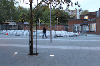
Upon arriving at our destination the space seemed open, bleak and without character. The World's End Place, Chelsea is a paved area containing a large ovular seating area (currently under reconstruction to introduce a new water feature) with additional seating blocks surrounding.

Due to the construction work, it proved to be difficult to fully grasp an honest representation of how the space was being used. However reviewing the smaller seating blocks suggested that the space was not used as a social space as initially intended, but rather as a thoroughfare.

View of the oval seating area from within the Worlds End Estate


After talking to a local policemen the overall impression we recieved with response to the space was confirmed by the local police officers. Upon being told the cost of £1.4 million, the immediate reaction was that 'the money could have been more wisely spent in an attempt to improve the local area'. They implied that the space served limited purpose as well as having little impact on the local community. However he did mention that 'the space became more interactive in the summer months'.

The encompassing area consists of The World's End Estate (ex-council), local amenities, a police station, a pub (currently closed), and  a communal theatre- all however appeared to be somewhat run down, whilst opposite the road lies the more desirable part of Chelsea- King's Road. The World's End Place almost seems an attempt at bridging a gap between those living in the ex-council estate and those occupying the more commercial shops on King's Road. The area at this time of year seemed to have limited usage, but with the local pub reopening in the summer, perhaps more life will be injected into the space.

World's End Pub
 
 
The flats inside the estate
Inside the World's End Estate, staircase
One of the main things we noticed was the lack of natural light in the area due to the height of the estate. When viewing the open space (around 2pm) we noticed that the sunlight only covered one third of the site-resulting in two thirds of a dark and much duller space. Taking this into account, the consideration of light becomes more important, with the introduction of spotlighting creating a more atmospheric and natural environment.

Below World's End Estate, Local Cafe